How we look and how we sound.
The rules for using Nemphi's name, logo, colors, typography and voice. Use them when you write about us, integrate us into your product, or make anything with the logo.
Shortcut: right-click the logo in the header to copy it as PNG or SVG.
The logo
The logo is the word nemphi in lowercase. The n's second leg rises, crosses the word as an azure line, passes behind the h and ends in an arrow over the i. It's the same line that runs through the whole site. The mark is the n with its line, for places the full logo doesn't fit: icons, avatars, favicons.
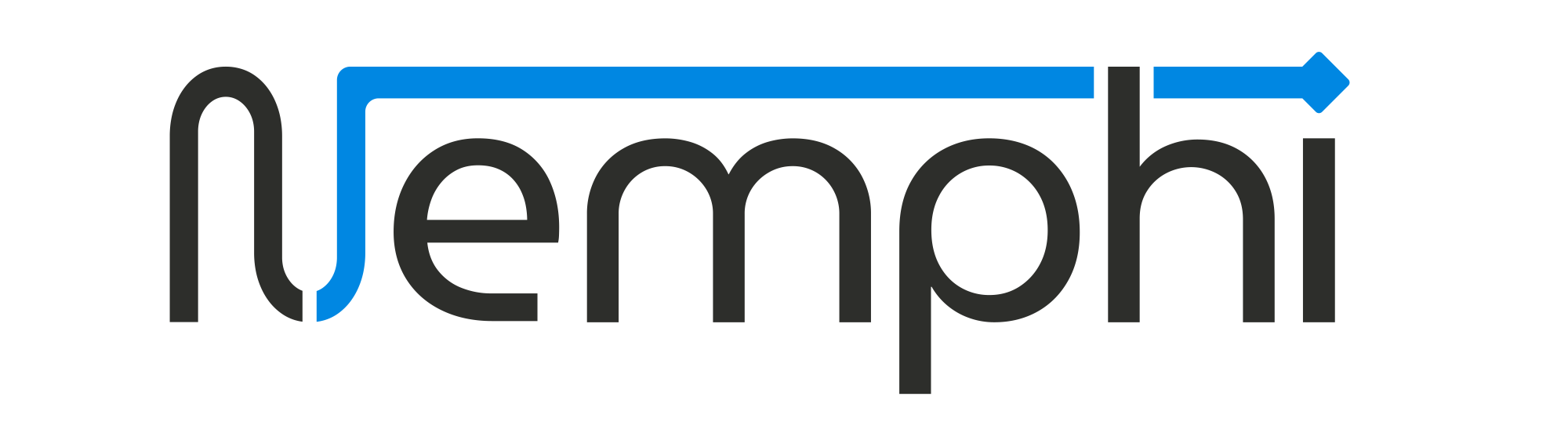
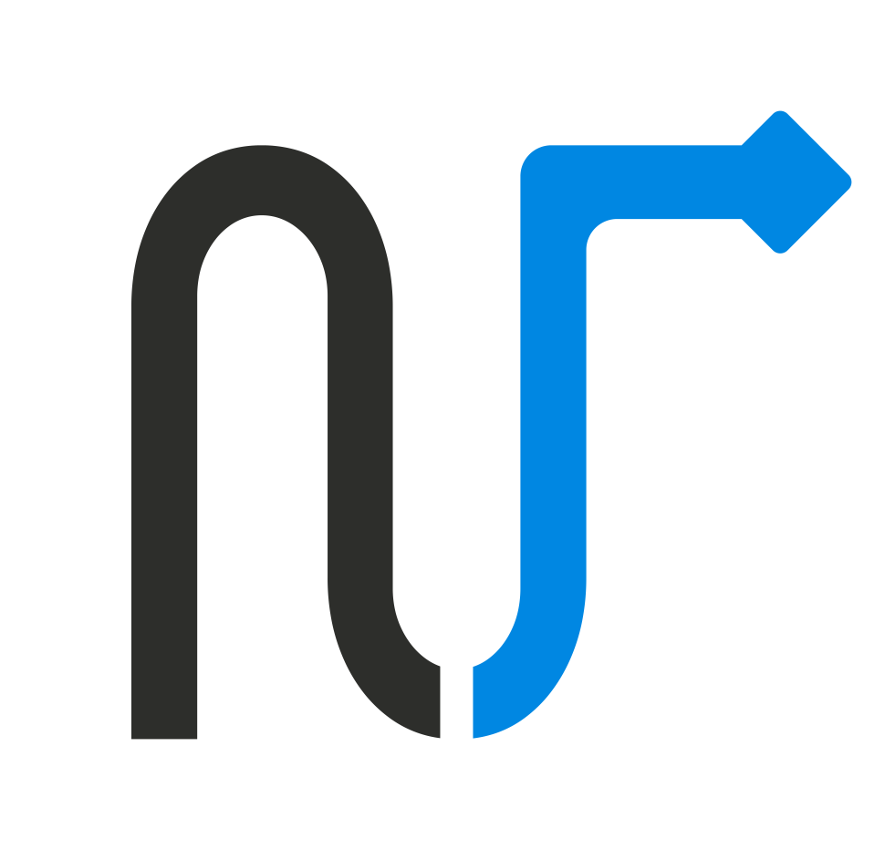
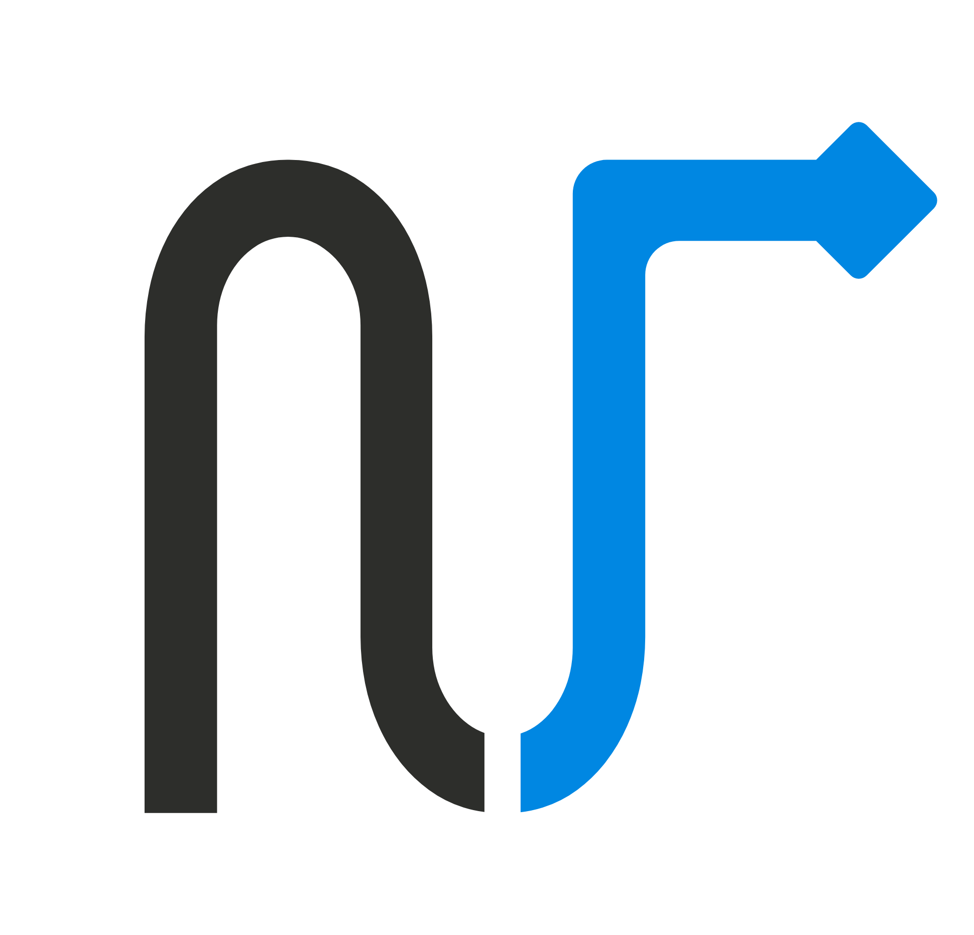

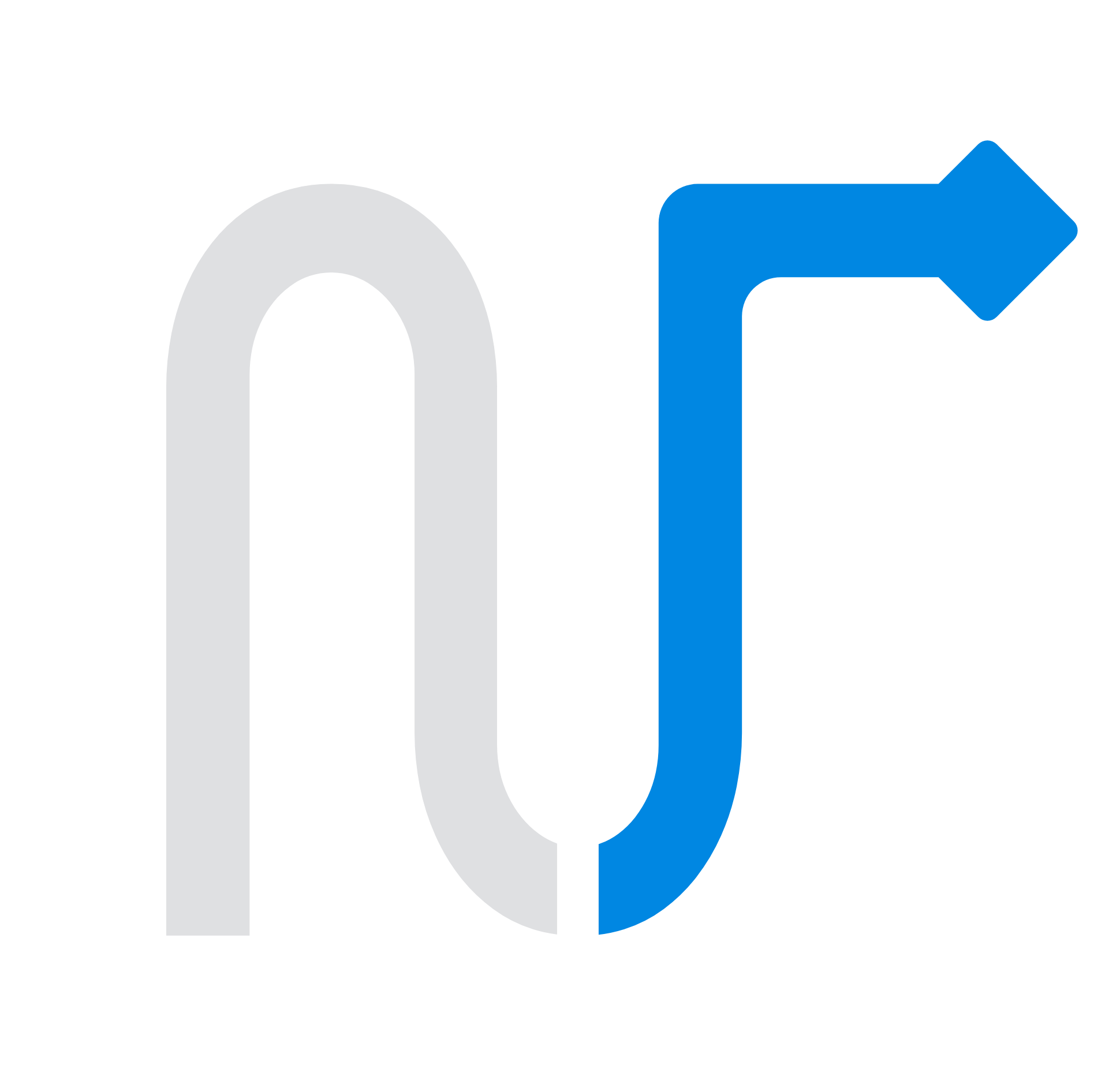
The arrow is always azure. The ink is charcoal on light backgrounds and light grey on dark ones; there are no other versions.
Space and size
Leave clear space around the logo equal to the height of the arrowhead (x). No text, borders or other images go inside it.
Minimum size
- Logo
- 96 px wide on screen, 25 mm in print
- Mark
- 16 px on screen, 6 mm in print
What not to do
The logo works because it always looks the same. Use it exactly as it comes in the download files.
Don't change the color of the arrow or the ink.
Don't stretch it or change its proportions.
Don't rotate it or set it on a diagonal.
Don't add shadows, outlines or gradients.
Don't place it on low-contrast backgrounds.
Don't set it in another typeface or in capitals.
Color
A cool neutral ground, charcoal ink and a single azure. Tap a color to copy its code.
Core
Azure is the main line: it marks everything active, selected or tappable. Charcoal and paper carry the rest.
Lines
Each area has its color, which appears only on its own line, always in this order. Never as decoration or a section background.
Signals
They show state and nothing else: approved, waiting for a person, denied.
Typography
One family: Geist. Geist Mono appears only where the product speaks in identifiers, such as tool names, codes and ledger times. Both are free (SIL Open Font License).
from to-do to done.
Delegate a task without losing control of what happens.
invoices.post · FE-1043 · 09:42
- Headings are lowercase, like the logo, and end with a period when they're a sentence.
- No small uppercase labels above headings.
- Numbers use the regular face with tabular figures, not Mono.
The name
In text, write Nemphi: a capital N and the rest lowercase. The logo is lowercase; the name isn't. In legal documents, the company is Nemphi Group S.A.S.
Like this
Nemphi
Not like this
- NEMPHI
- NemPhi
- Nemfi
- nemphi (in text)
Voice
We talk like someone who knows what they're doing and respects your time.
Clear and direct
Short sentences that state things. What matters comes first.
Second person
We speak to one person, as “you”, without extra formality.
No hype
No “revolutionary” or “the best”. We never make up numbers, customers or testimonials.
Show the mechanism
We say what happens: who asked, what the agent prepared, who approved it and where it was recorded.
Like this
Your business on autopilot.
Not like this
Revolutionize your company with the power of AI!
Like this
You approved invoice FE-1043 and it was recorded in the ledger.
Not like this
Done! Everything went perfectly.
Need something else?
If you need another format or have a question about the brand, write to [email protected].